Your axe-core scan comes back with one line that actually matters: color-contrast: Elements must have sufficient color contrast (serious). The JSON output gives you a computed ratio, something like 3.8:1 against a 4.5:1 minimum, and the text in question looks completely fine on your screen. That’s usually the moment the frustration kicks in, especially when this shows up in a CI gate an hour before a release and nobody remembers changing that color.
This article walks through the actual causes I’ve hit debugging this violation across real projects, how to tell which one applies to you, and the color contrast error fix that holds up under a real screen reader or low-vision user, not just a green check in axe DevTools.
The color-contrast violation almost always comes down to one thing: the computed ratio between text color and its background falls short of the color contrast ratio WCAG sets in 1.4.3, a minimum contrast ratio of 4.5:1 for normal text or 3:1 for large text (18pt regular, or 14pt bold and up).
The actual fix is to change the foreground or background color until a real contrast checker tool confirms the ratio clears that threshold, not to hide the warning some other way. In a small number of cases axe-core can’t reliably evaluate the element at all, text sitting on a background image is the classic example, and that changes what you do next.
- What the axe-core Color-Contrast Violation Actually Means
- The Real Root Causes, Ranked by How Often I Actually See Them
- The Color Contrast Error Fix for Each Cause
- The Fix People Reach for First, and Why It Doesn't Work
- Before You Apply Any Fix, Check This
- How to Confirm the Fix Actually Holds
- How to Prevent This from Coming Back
- The Takeaway
- Frequently Asked Questions (FAQs)
What the axe-core Color-Contrast Violation Actually Means
The axe color-contrast rule pulls the resolved foreground and background colors for a text node, converts both to relative luminance using the same math WCAG uses, and compares the resulting ratio against a threshold. Normal text needs 4.5:1. Large text, defined as 18pt regular or 14pt bold and up, only needs 3:1, because bigger strokes stay legible at lower contrast.
Here’s the part most write-ups skip. axe-core’s color-contrast rule can’t reliably evaluate text over a background image, so it skips the check entirely in that case rather than fail it. That’s a false negative, not a pass, and I’ve seen teams treat a clean scan as proof a hero banner was fine when nobody had actually checked it.
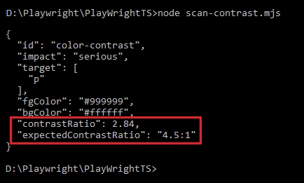
The violation itself usually looks like this in the JSON output:
{
  "id": "color-contrast",
  "impact": "serious",
  "description": "Ensure the contrast between foreground and background colors meets WCAG 2 AA minimum contrast ratio thresholds",
  "nodes": [
    {
      "target": ["p"],
      "any": [
        {
          "id": "color-contrast",
          "data": {
            "fgColor": "#999999",
            "bgColor": "#ffffff",
            "contrastRatio": 2.84,
            "expectedContrastRatio": "4.5:1"
          }
        }
      ]
    }
  ]
}
That contrastRatio field is your first diagnostic clue. It tells you exactly how far off you are, which matters, because a 4.4:1 fix is a one-line color tweak and a 2.1:1 fix usually means someone picked a color with no contrast intent at all.
For the full rule definition and the algorithm it runs, Deque’s axe color-contrast rule documentation is worth bookmarking, and the WCAG 1.4.3 Contrast (Minimum) success criterion explains the reasoning behind the specific ratio numbers.
The Real Root Causes, Ranked by How Often I Actually See Them
Six causes account for almost every color-contrast violation I’ve debugged. They’re not equally common, and knowing which one you’re looking at before you touch any CSS saves real time.
| Cause | How to tell it’s this one | Fix |
|---|---|---|
| 1. Design-system gray text too light | JSON ratio is just under 4.5:1, usually 2.5–3.9:1; color is a shared “neutral” gray like #999 or #aaa used across many components | Darken the foreground (or lighten the background) until the ratio clears 4.5:1 |
| 2. Missing background or foreground declaration | Component sets color but not background-color (or the reverse) and relies on inheritance; passes in one container, fails in another | Make both values explicit on the component itself instead of relying on inheritance |
| 3. Disabled-looking text that’s actually interactive | Element has no disabled attribute or aria-disabled, but is styled gray like a disabled control | Add real disabled/aria-disabled where it applies, or fix the contrast if it’s genuinely active |
| 4. Text over a background image or gradient | axe-core reports nothing for this element at all, no pass, no fail, it’s just absent | Manually check contrast at the image’s worst-case point with a contrast checker tool, add a scrim if needed |
| 5. Hover, focus, or visited link states | Default page load passes the scan; the issue only shows up when interacting | Re-run the scan with the pseudo-class forced, or check computed styles by hand |
| 6. Large-text threshold miscounted | Text is bold at 14px thinking it clears the 3:1 threshold, but 14px bold is under the actual 14pt bold minimum | Either bump the size to a real large-text threshold, or hold the color to 4.5:1 instead |
The Color Contrast Error Fix for Each Cause
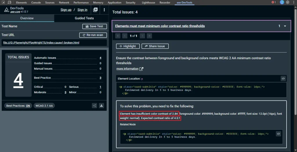
Cause 1: design-system gray text. This is the one I see most, usually because a “muted” or “secondary” text color got picked for how it looked next to a colored card, not against the actual white background it ends up on somewhere else.
/* Broken: ratio is 2.84:1 against white */
.card-subtitle {
  color: #999999;
  background-color: #ffffff;
}

/* Fixed: ratio is 4.55:1 against white, clears the 4.5:1 minimum */
.card-subtitle {
  color: #767676;
  background-color: #ffffff;
}
To apply this fix properly:
- Pull the exact foreground and background hex values from the axe-core violation JSON or your browser’s devtools computed styles panel.
- Run both values through a contrast checker tool, WebAIM’s is the one I use, to confirm the real ratio. Don’t trust the JSON blindly if the element has any transparency layered on top.
- Adjust the foreground color until the ratio clears 4.5:1 for normal text, or 3:1 for large text.
- Re-scan the whole component library, not just the one instance you found. Shared gray tokens like this get reused everywhere.
Cause 2: missing background or foreground declaration. This one is sneakier than cause one because the CSS itself isn’t wrong, it just isn’t complete. A component sets color but leaves background-color to inherit from whatever wraps it, or the reverse. It looks fine in the container it was built in, then someone drops the same class into a differently themed section, a footer, a dark-mode wrapper, and the inherited background changes while the text color doesn’t. WCAG actually documents this as its own failure mode (F24), not just an axe-core quirk.
/* Broken: only color is set, background is inherited from wherever this ends up */
.badge {
  color: #ffffff;
  font-weight: 600;
}

/* Fixed: background is explicit, so contrast holds regardless of container */
.badge {
  color: #ffffff;
  background-color: #2f6f4f;
}
To track this one down:
- Search your CSS for text-bearing classes that set
colorwithout a matchingbackground-color, or vice versa. A quick grep forcolor:and a manual check of the paired declaration usually finds them fast. - Test the component inside at least two different containers or themes, not just the one it was designed against. This is how the bug hides, it passes in isolation and fails on reuse.
- Make both values explicit on the component itself rather than trusting inheritance, even if the inherited value happens to work today.
- Re-run the scan against every page or story where the component actually appears, not just its default state in isolation.
Cause 3: disabled-looking text that’s actually interactive. This one is a genuine bug, not a scanner overreacting. Someone styled a button or field to look inactive, gray text, muted background, but never actually disabled it. It’s still clickable, still tab-focusable, and still fails contrast, because axe-core only exempts elements that are genuinely marked disabled.
<!-- Broken: styled like a disabled button but fully clickable and focusable -->
<button class="btn-muted" onclick="submitForm()">Continue</button>
.btn-muted {
color: #999999;
background-color: #f0f0f0;
}<!-- Fixed option A: genuinely inactive right now, let the disabled attribute do the work -->
<button class="btn-muted" disabled>Continue</button>
<!-- Fixed option B: actually interactive, so give the element real contrast instead of a disabled look -->
<button class="btn-muted-active" onclick="submitForm()">Continue</button>.btn-muted-active {
color: #1a1a1a;
background-color: #f0f0f0;
}To fix this one:
- Decide what the element actually is first. If it’s meant to be inactive until some condition is met, that’s a state problem, not a color problem.
- For a genuinely inactive control, add the
disabledattribute (oraria-disabled="true"on custom components that can’t use nativedisabled). axe-core excludes properly disabled elements from this rule. - If it’s actually interactive right now, don’t fake the disabled look. Fix the contrast the same way you would for cause one.
- Re-test with both a mouse and a keyboard. An element that looks disabled but responds to clicks is confusing for more than just contrast reasons.
Cause 4: text over a background image. Since axe-core can’t evaluate this reliably, the fix has to be manual, and it has to account for the worst part of the image, not the average.
.hero-text-wrapper {
  position: relative;
}

.hero-text-wrapper::before {
  content: "";
  position: absolute;
  inset: 0;
  background: rgba(0, 0, 0, 0.55);
}

.hero-text {
  position: relative;
  color: #ffffff;
}
Steps for this one:
- Find the darkest and lightest regions of the image where the text actually sits. Hero banners that cross both sky and a dark building are the usual culprit.
- Sample the worst-case background color at that point and run it against your text color in a contrast checker tool.
- If it fails, don’t just darken the text and hope. Add a scrim behind the text so contrast holds no matter what image gets dropped in later.
- Log the manual check somewhere your team can see it. A code comment or a line in the test report works, since axe-core will stay silent on this element forever.
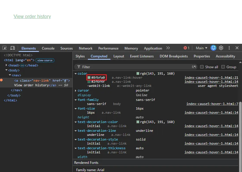
Cause 5: hover, focus, or visited link states. The default page load passes clean, but nobody re-checked what happens when a real user interacts with the page. This is the one that most often slips through design review, since reviewers usually look at the static mockup, not the hover state.
/* Broken: default state passes at roughly 6:1, hover drops to about 2.1:1 on white */
a.nav-link {
  color: #2f6f4f;
}

a.nav-link:hover {
  color: #8fbfa0;
}
/* Fixed: hover stays above the 4.5:1 minimum */
a.nav-link:hover {
color: #1f4f34;
}To catch and fix this one:
- List every interactive text element and its
:hover,:focus, and:visitedvariants, not just its default appearance. - Use your browser devtools’ “force element state” toggle to render each pseudo-class, then read the computed color from the styles panel.
- Run every state’s foreground/background pair through a contrast checker tool, one at a time.
- Fix whichever state fails. It’s almost always hover, since it’s the one state nobody visually reviews during design handoff.
Cause 6: large-text threshold miscounted. The WCAG large-text exception only applies at 18pt (about 24px) regular weight or 14pt (about 18.66px) bold and up. A lot of “helper text” and “optional field” labels get styled bold at 14px CSS pixels, which is under that bold minimum, so the 4.5:1 rule still applies.
<!-- Broken: 14px bold doesn't meet the large-text size threshold -->
<p style="font-size: 14px; font-weight: 700; color: #767676;">Optional field</p>

<!-- Fixed option A: bump to a real large-text size -->
<p style="font-size: 19px; font-weight: 700; color: #767676;">Optional field</p>

<!-- Fixed option B: keep the size, raise the ratio for normal-text rules -->
<p style="font-size: 14px; font-weight: 700; color: #595959;">Optional field</p>
If you’re automating this detection, here’s the Playwright and AxeBuilder setup I run in CI:
import { test, expect } from '@playwright/test';
import AxeBuilder from '@axe-core/playwright';

test('page has no color-contrast violations', async ({ page }) => {
  await page.goto('https://example.com');

  const results = await new AxeBuilder({ page })
    .withTags(['wcag2aa'])
    .include('#main-content')
    .analyze();

  const contrastViolations = results.violations.filter(
    (v) => v.id === 'color-contrast'
  );

  expect(
    contrastViolations,
    JSON.stringify(contrastViolations, null, 2)
  ).toEqual([]);
});
I run something close to this as a required check in a GitHub Actions workflow, gated on serious and critical impact only. Blocking every build on every axe-core rule tends to get the whole gate disabled by an annoyed team within a month.
If you’re setting this up for the first time, my getting-started walkthrough for axe-core covers the install and first scan in more detail than fits here.
If you just need to fix color contrast issue reports on one component right now and don’t have time to read the rest, start with cause one above. It’s the most common by a wide margin.
The Fix People Reach for First, and Why It Doesn’t Work
Most people’s first instinct when they see a color-contrast warning is to nudge the opacity up slightly, or add a subtle text-shadow, hoping it reads better without touching the brand color. That doesn’t move the computed ratio at all. axe-core, and a real low-vision user, are still looking at the exact same underlying color value. It passes nothing and fixes nothing.
A lot of teams reach for an accessibility overlay widget to make this class of violation disappear site-wide instead of touching CSS. I’ll say this plainly: in most cases that’s not a fix. Overlays generally can’t reliably rewrite computed contrast across a live page, they’re known for breaking on dynamic content, and several overlay vendors have themselves been named in ADA lawsuits over the exact violations they claimed to solve.
So the actual color contrast error fix is boring. Change the hex value. Confirm the ratio. Ship it. There isn’t a clever shortcut here, and I’d be skeptical of anyone selling one.
Before You Apply Any Fix, Check This
If you’re not sure which of the six causes above applies, check three things. First, the axe-core JSON: does it show a real computed ratio, or is the element simply absent from both the passes and violations lists, which points to a background-image false negative?
Second, open the element in your browser’s accessibility tree inspector and check the resolved foreground and background values, inherited colors and transparency rarely match what the CSS file implies on its own. Third, if the scan passes but you’re still uneasy about it, run it past a real screen reader anyway. Contrast doesn’t change what a screen reader announces, but it’s a fast way to confirm you’re actually looking at the element you think you are.
Two more things worth knowing before you touch anything. WCAG treats 4.5:1 and 3:1 as hard cutoffs, not rounded targets, so a computed ratio of 4.49:1 does not pass, even though it looks close enough to wave through. And if the flagged text is part of a logo or brand wordmark, it’s exempt from this success criterion entirely, that’s a legitimate reason to leave it alone rather than a false positive you need to chase down.
How to Confirm the Fix Actually Holds
A green check in axe DevTools is a start, not the finish line. I’ve watched a color fix pass every automated scan and still get bounced back by a design reviewer at 200% browser zoom, because nobody re-checked the hover state and it slipped under 4.5:1 the moment a pointer moved over it.
Three checks I run before calling a color-contrast violation actually resolved:
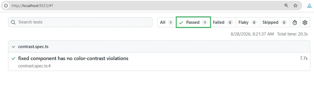
- Re-scan with Playwright and AxeBuilder against the updated component, not just the browser tab you happened to be looking at.
- Zoom to 200% and, if your product supports it, check dark mode or Windows High Contrast mode. Some fixes that pass at default zoom fall apart under forced-colors.
- Check every interactive state by hand: default, hover, focus, visited, disabled. axe-core only evaluates whatever state happened to be rendered when the scan ran.
If all three hold, you’re done. If the fix only survives step one, you’ve silenced the scanner, not fixed the problem for the person who actually needs it.
One more edge case worth knowing about. A color pairing can pass the ratio math on paper and still look faint on screen if the font is thin or your browser’s anti-aliasing renders it lighter than the raw hex value suggests. WCAG’s own guidance is to evaluate the underlying color values rather than the rendered pixels, but if you’re using a genuinely thin font, aim past the minimum ratio instead of exactly at it.
How to Prevent This from Coming Back
A few habits cut down how often this violation reappears. None of them are exotic.
Keep a small, pre-verified palette of grays that are already checked against your actual background colors, so nobody has to guess a hex value under deadline pressure. Run the axe-core check as a scheduled nightly scan in addition to the pull-request gate, since hover and focus states often only get exercised by real usage patterns, not a fresh page load.
And when a designer hands off a new “muted” text color, run it through a contrast checker tool before it ever reaches a component library, not after a scanner catches it in production.
The Takeaway
A color-contrast violation almost never needs an exotic fix. Change a hex value until the math clears 4.5:1, or 3:1 for genuine large text, then check that it holds up outside the one component where axe found it. The habit that saves the most time across the accessibility work in this blog’s complete accessibility testing guide for QA engineers applies here too: let the scanner tell you where to look, then verify it yourself with a real contrast checker tool. That’s the actual color contrast error fix, not the fastest way to make a warning disappear.
Frequently Asked Questions (FAQs)
Why does my color-contrast violation say “serious” but the text looks fine to me?
Contrast is measured against a ratio, not personal perception. Someone with typical vision often can’t tell the difference between 3.9:1 and 4.5:1 on a bright monitor, but that gap is exactly what causes real trouble for low-vision users, which is the whole point of the WCAG 1.4.3 threshold.
Does axe-core check hover and focus states automatically?
No. It only evaluates whatever state is rendered in the DOM at the moment the scan runs. Hover, focus, and visited states need to be triggered manually or forced through a pseudo-class before you re-scan, otherwise they’re invisible to the tool entirely.
Does this rule apply the same way under WCAG 2.2?
Yes. Success Criterion 1.4.3 itself didn’t change between WCAG 2.1 and 2.2. WCAG 2.2 added new success criteria in other areas, but the contrast minimum ratio and its thresholds are unchanged, so a fix verified under 2.1 still holds under 2.2.
Is this the same for mobile or Appium accessibility scans?
Not exactly. axe-core is DOM-based and doesn’t run against native mobile views. Appium-driven accessibility checks typically rely on platform tools instead, like Android’s Accessibility Scanner or Xcode’s Accessibility Inspector, and the violation format looks different even though the underlying contrast concept is the same.
Why did my fix pass in the axe DevTools extension but still get flagged in CI?
Usually a version mismatch between the browser extension and the @axe-core/playwright package pinned in your project, or a different viewport triggering a responsive style that changes the computed color. Check both before assuming the fix itself is wrong.